

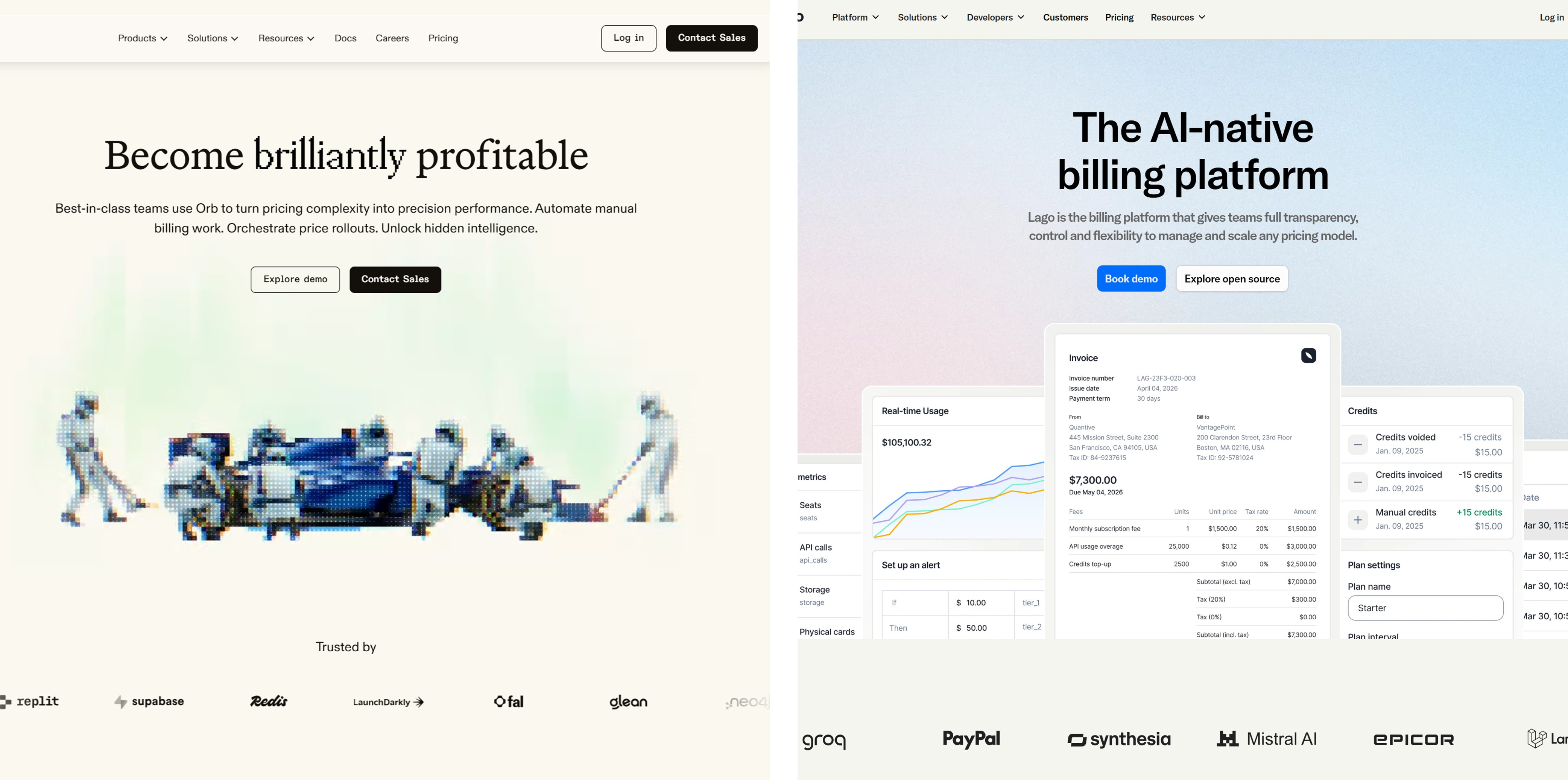
The great beigening of billing
Two billing vendors have emerged from their chrysalises in 2025, wings still wet, desperate to look "mature", but they end up looking the same.

Lago and Orb have both undergone rebrands to kick off 2026. Lago says they’re “growing up”, while Orb claims they’re “more confident, more grounded”.
The bird thinks both have committed the cardinal sin of B2B SaaS design: beige. Trust funds in beige cashmere sweaters.
No bite. No memory retention whatsoever. Utterly forgettable.
Open-source darling Lago’s CEO posted the rebrand with the energy of someone announcing they’ve finally organized their sock drawer. "Shoutout to the design team for... what, exactly?
Orb, meanwhile, went full design manifesto. Their Head of Design wrote a thesis comparing the rebrand to “personal growth” and called the project “Mirrorball”. They waxed poetic about their logo’s “r” resembling an Allen wrench, a symbol of “building and flexibility”.
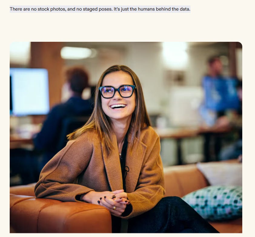
“No staged poses” they say, but it sure does look like one.
The translation: “We hired an agency, they charged us six figures, and we’re now legally obligated to pretend this means something more serious”.
The bird thinks both companies are terrified.
Lago and Orb are trying to rebrand themselves as “AI native” because every billing vendor is scrambling to own the narrative that AI changes everything.
But instead of differentiating, they’ve all converged on the same beige, gradient-heavy, “trust us we’re serious now” aesthetic.
Serif fonts (to look “editorial”)
RGB gradients (because “digital”)
“Mature” messaging (translation: boring)
A manifesto blog post that uses the word “architecture” at least twelve times
A CEO LinkedIn post thanking the design team with zero specifics
Most billing sites now looks like a YC startup circa 2023.
Indistinguishable. Forgettable. Safe.
Lago actually had something with their manifesto.
“An engineer is crying at their desk because they’ve spent 2 days on the logic of converting purchased credits into a usage allowance? That’s just how things are.”
That is a voice. That’s differentiation. That’s the kind of writing that makes engineers who have dealt with this send it around. Instead, they “grew up” and now sound like everyone else.
Orb could have leaned into their technical depth. They could have made their brand about precision, control, power. Instead, they made it about... Allen wrenches and personal growth metaphors.
Both rebrands suffer from the same disease: fear of being different.